What
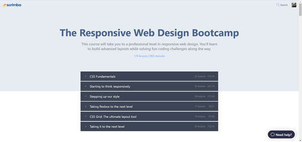
The course is about web responsive design using HTML and CSS.
The topics covered are comprehensive, yet not all is covered (I will detail later on).
Where
The course is taught on Scrimba, an interactive course platform with tons of free courses already and many paid courses that, in my opinion, are really worth it, at least for this course I am reviewing.
The course is found through this link (non-affiliated).
The platform itself is actually what made me buy the course. You can interact with the video as you go and edit the code the teacher typing. Cool, uh?
Even better, you can save your edits to the code so that you can follow along the version of the teacher and go back to your version (e.g. it is kinda of a branch like in Git) when you pause the video.
This is something I haven’t seen anywhere else (I have done course on Udemy and Audacity) and this tops all of them.
I recommend having a try by signing up. Pick a free course and see it for yourself.
Who
Kevin Powell is the teacher. His curriculum is impressive and yet, I didn’t know him before the course.
Throughout the course, you will find out that his voice is clear and his words are accurate to explain the concept at hand.

I am experienced in the CSS and HTML technologies, having worked in the Web sphere since 2009. So I actually went 1.4x time the normal speed throughout the course ;)
Still, when I was stuck in a point, Kevin’s examples made it clear and I really feel like I saved into my programming toolkit the skills taught by him to really be able to apply it in the real-life scenarios.
The Good
Let’s now review the course: I thought I knew my topic… How wrong was I!
First, typography: I knew that using relative units as better than fixed units. Well, how thankful was I to learn exactly when to use each unit.
For example, rem is the recommended units for font-size while em is the unit we should prefer to px.
Second, Flexbox: who hasn’t used float in the last 10 years? who wasn’t tired of it and used Bootstrap to create “grid-like” layout that didn’t break?
Yes, but even with Bootstrap, and maybe I wasn’t using it properly, I feel like I was replacing the CSS hell with the HTML hell. What I mean by that is that the markup felt much more dense or decorative than for the purpose of the layout. You know the “Callback hell” in JavaScript, well I felt the “<\div> hell” with Bootstrap.
Note: I have use Bootstrap 4 over the past year for work (not that I chose it) and I think the version 4 has helped a lot to solve the version 3 issues.
I think that the content and project of the course are well made and I was actually pushed to test more as Kevin always emphasized.
For example, I made this utility to visually see the result of the properties flex-directions, align-items and justify-contents.
Third, CSS grid: it was the one topic I was, kind of, apprehending. I started Wesbos’s course but I didn’t finish it. I’m not saying it is because Wes but I wasn’t motivated enough.
With Kevin, I was and I not only learned a lot of cool tricks to build a template layout but also I learned to use it in ways that I didn’t expect.
Now, it is full-speed ahead with CSS Grid and Flexbox, the vanilla style when it is possible.
The Bad
The main element missing, in my opinion, in the course is a more detailed use of web responsive images.
In my opinion, images are not only about ‘width: 100%’ and ‘object: fit’ ;)
What about ‘scrset’ and ‘sizes’?
How and when to use them?
I know that those attributes are not supported with IE and even not with Edge 14 and lower, but I think it is an important part of the web and images will always be displayed on websites :)
Adding this missing bit would make the course more complete.
Images are a big part of the web space. Even on Medium.com, you can see a lot of images.
Summary
I recommended the course for anyone who is self-taught.
Why? Because, in fact, the course is done well and you can learn from others.
Sometimes, especially with fundamentals like CSS and HTML, learning it wrong may be hard to unlearn later (it depends on your mindset and if you are willing to learn from others).
Personally, I measure the value of this course by learning the skills to build a website without any CSS framework (ok, except Font Awesome, but I’m looking to build that from scratch) like Bootstrap or Foundation (I know the former only).
Going through the entire course took me :
- 2.65 hours for module 1
- 7.77 hours for module 2
- 7.70 hours for module 3
- 5.53 hours for module 4
- 5.60 hours for module 5
- and finally a good 14 hours for module 6.
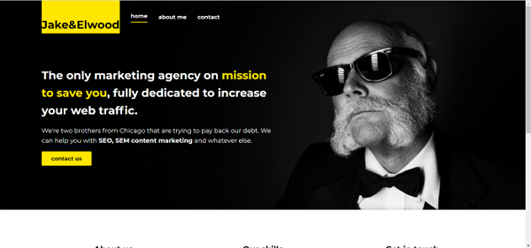
So I took me 43.25 hours to complete the course and really increase my skills. That’s only 4 and a half weeks if you work 2 hours per weekday on it. On the final project, I did try my best not to watch Kevin’s solution, hence the greater amount of time spent. When I got stuck (ex: the hero image, the main grid trick, the mobile menu), I was watching the videos to be inspired but then, his solution is different than my final render.

Now, before moving to JavaScript or ReactJS or Vue or UI courses, I’d like to apply my skills to undo all the Bootstrap 3 templates I used on my existing projects and see if I can achieve the same look and feel with no HTML template and css framework (except Font Awesome.
I am certain I can :)
My study website is hosted powered by the awesome Netlify.
Thanks Kevin. Thanks Scrimba team for this opportunity to learn.
